
Once, in a Buddhist monastery, a cat wandered in the meditation halls and distracted monks. So, each meditation time, that cat was tied to the hall’s door. Time passed, and now there is a specially groomed cat that must be tied to the door for a meditation to start.
It took monks several lifetimes to forget the reason why the cat was tied, but in the digital ecosystem time flies much faster. Metaphors that helped people understand what each thing was for are long gone.
Fifty years ago, every office clerk knew what ‘inbox’ is for. And it was helpful, to show that label in the electronic mail interfaces. Now it is just a label with no meaning. People must memorize it and recall not the experience but knowledge.
Do you still remember what ‘save’ icon meant? And why we use ‘chain link’ next to the URL links? Why we call ‘#’ an anchor? All those were experience-based metaphors that are long gone. They need learned knowledge and cognitive effort to be recalled.
Of Icons and Labels
The tradition of labelling buttons with texts and icons is not that old. It all started around XVIII century, when manufacturers started putting labels on tools they made. Labels at the time were needed to distinguish one knob from another, but not more than that.
Everything changes in the 1960s, when the lady Ms Production met the gentleman Mr Marketing. Two things happened roughly at the same time.
First, mass production led to mass market. One tool was produced to fit many markets in many countries. Thus, text labels became a problem — one can’t put all versions of the word ‘play’ next to a small button of a tape-machine. Pictograms — now known as icons — were born. They compacted a label into a symbol, quite often depicting the tool’s internals. The ‘play’ icon was a tape-machine record-head descending the tape. And the ‘stop’? The same record-head, this time ascending.
Second, more and more tools were produced for mass consumers. Not for professionals, who learned how to use their tools from fellow professionals. For laymen, regular people. Those had no idea what each knob was about. Their idea for ‘play’ was that the tape will start to roll, and the music will start to play.
Of course, designers felt the marketers’ need to educate. After all, the former was paid by the latter. Half a century past, we all use interface controls which were designed to educate us.
We Don’t Need No Education
Let’s think in contrary. How would we design a digital interface that won’t be needing no education?
Even more, how could we design an interface for a digital tool that is not based on previous experience with other tools? How can we throw away our dozens of years of digital experience?
How can we unlearn our preconceptions and build an interface based on pure perception? Especially if the interface is more complex than a doorknob.
The answer is... allegory.
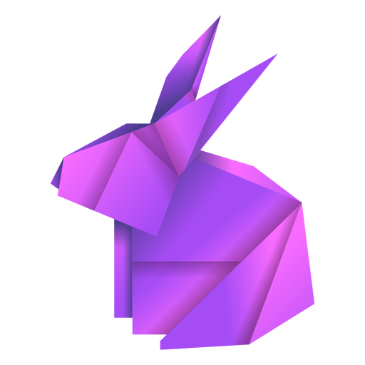
折り紙, Origami
Origami literally means ‘folded paper’. Deemed one of the most ‘Japanese’ things ever, it originated in China. People sacrificed money to gods by burning it. As gold doesn’t burn well or (this is important) willingly, a paper solution was born. A paper-made golden ingot looks like a golden ingot but is in fact a piece of paper. And if the gods can be fooled, why can’t we?
Today’s origami is a form of art. A drawing made by folding. A symbol aimed for human imagination, but not as a pictogram, not as an ‘icon’.
Origami symbols are not ‘words’, they are poems. They convey rich feelings, themselves being just a poor piece of paper.
Here is an origami of a rabbit.
Here is a poem.
Sweet carrot’s crunched
By my little friend. My sleeves
Are suddenly wet.
The author of both wants to give us an emotion. Neither rabbit’s dimensions, nor its genus, nor even its colour or the texture of its fur.
A feeling.
All human people are capable of feelings.
How to Design with Allegory
The Allegory Paradigm, taken to extremes, stops us from using symbols borrowed from any tool that our users should have used before. At least, from digital tools.
We must stop borrowing each other’s UI controls.
Including text — in cases when it serves as a symbolic label, not as the message itself. This essay is a message, while the ‘followers’ in ‘25 followers’ next to it — is not. The notion of ‘followers’ is a convention, based on the learned concept of ‘following’.
Instead of asking the user to learn or guess what ‘follower’ means, we should create an impression of those ‘25 followers’ in a way that will give the user a feeling what it means for them. Why should they care about the number 25 at all?
Is twenty-five a lot?
Why do we care how many people there are? Of course, being alone is different from being in a small group of friends, and that is different from being in a crowd. Those are different feelings. And our goal here is to express this idea, in a poetic, sensual form that will pass the cognitive filters of our users and hit their minds directly.
Is there anyone important?
Why do we care which people we are with? Of course, being in a group of friends is different from being in a group of strangers; different from being locked in with your nemesis. Those are different feelings. And our goal stays the same.
We are designing then, for direct perception, not for preconception.
Designing for Virtual Reality
Virtual Reality gives us an opportunity to rethink and reconsider how we interact with digital products and with people in digital environments. Let’s not waste the opportunity.
VR products showcase a variety of interfaces that are somewhat similar to each other. They form several well-explored groups:
Meta UI: Heads-up-display interfaces that are placed between the user’s eyes and the world that the user is in. They only exist for the given user and neither other users nor the user’s avatar can see them.
Spatial UI: Interfaces that are put in the world and travel with user’s avatar, being at a fixed distance from the user. Again, nobody except the user can possibly see them.
Diegetic UI: Interfaces that belong to the world, being its natural part.
The latter group of interfaces is often praised for its potential for immersion and in some cases even called ‘no-UI’ to signify how far it has gone from what a conventional UI is.
However, even this group bases its existence on the same paradigm: each of the UI controls is presented as a metaphor of a tool, previously learned in another context.
The approach is reasonable and well-founded. When we meet a tool that looks like some another tool, we leverage our previous experience. If we see a pen, we remember another pen we used before. If we see a knob on a door — the infamous example of affordance — we remember another door that led us to this one. If we see a button, we click. I mean, we press it.
As designers, we are tempted to put an icon on the button to explain what it is for; an icon that will help our users to recall the actual object and to transfer the metaphor. Once we do so, we betray the affordance: we will turn back to the conventional paradigm of ‘labeling’.
Design for Tomorrow’s Yesterday
While the mainstream design paradigm is aimed for recognition of experiences previously learned, it mandates users to remember lots of things that don’t have deep meaning for them. It mandates designers to educate users with their designs. It mandates marketers to perpetuate patterns that are already learned.
To build a novel virtual reality interface, we should find concepts that appear directly in user’s eye, skipping the cognitive recollections and address the user’s perception and user’s senses.
We should build our interfaces on allegory, and to do so, we should discover deeper meaning of the things for which we build the UI.
We should design things as they are, not as they are for, today. Because the today’s ‘for’ will pass, but the things’ ‘are’ will stay.
How refreshing
The whimmy of a packhorse
Unloaded of everything!
— Shigematsu Sōiku